
Lunar Paper
English
Applications / Design and media

Brand Hub

Brand Hub brings colours, typography, logos, design tokens, guidelines and production specifications into one governed identity system, where teams can build reusable standards, check accessibility, manage approved versions and carry consistent brand decisions into connected creative tools.

Highlights · 01

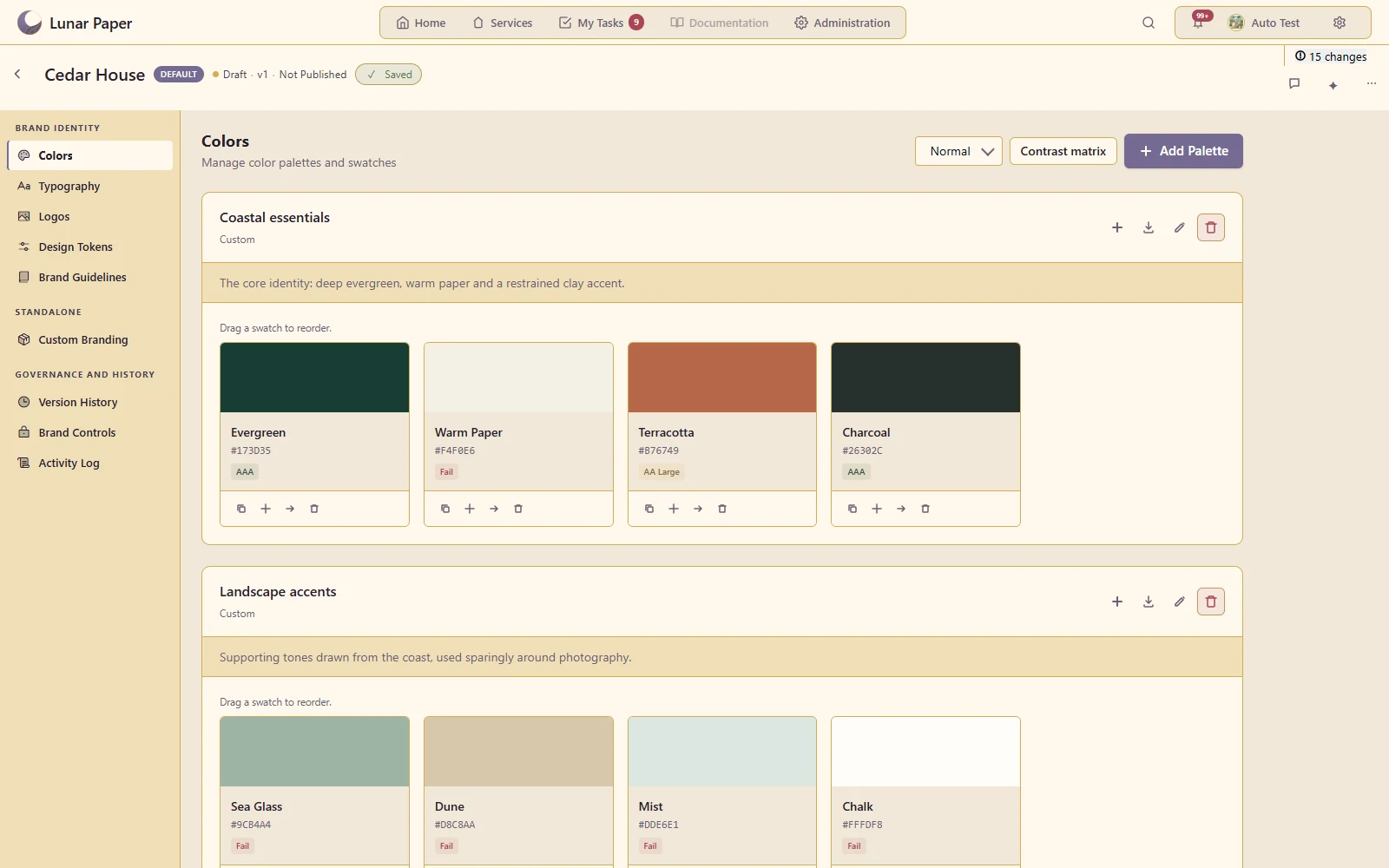
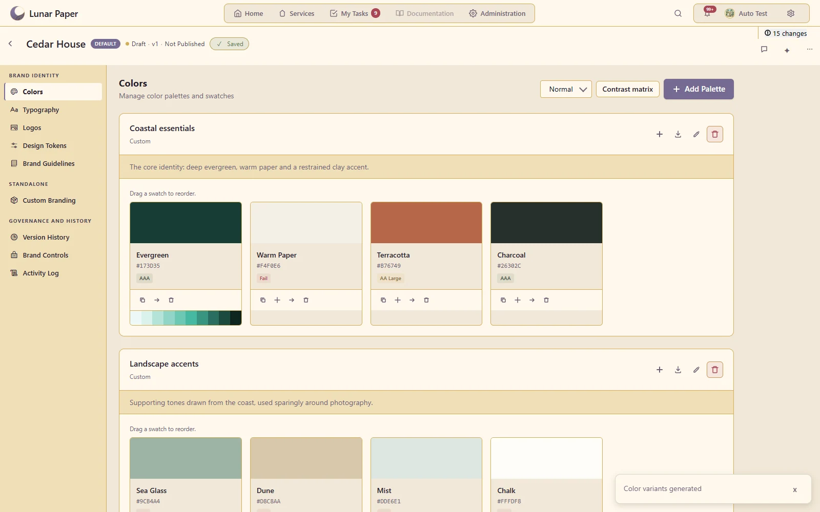
Colour palettes

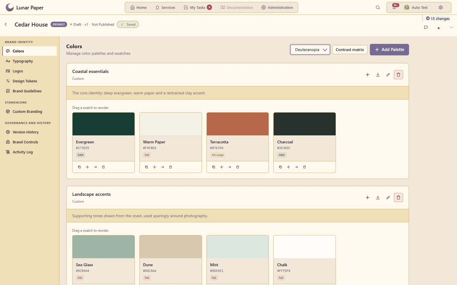
Define named colour collections with usable brand values.

Maintain named core and landscape palettes with usage guidance
Highlights · 02

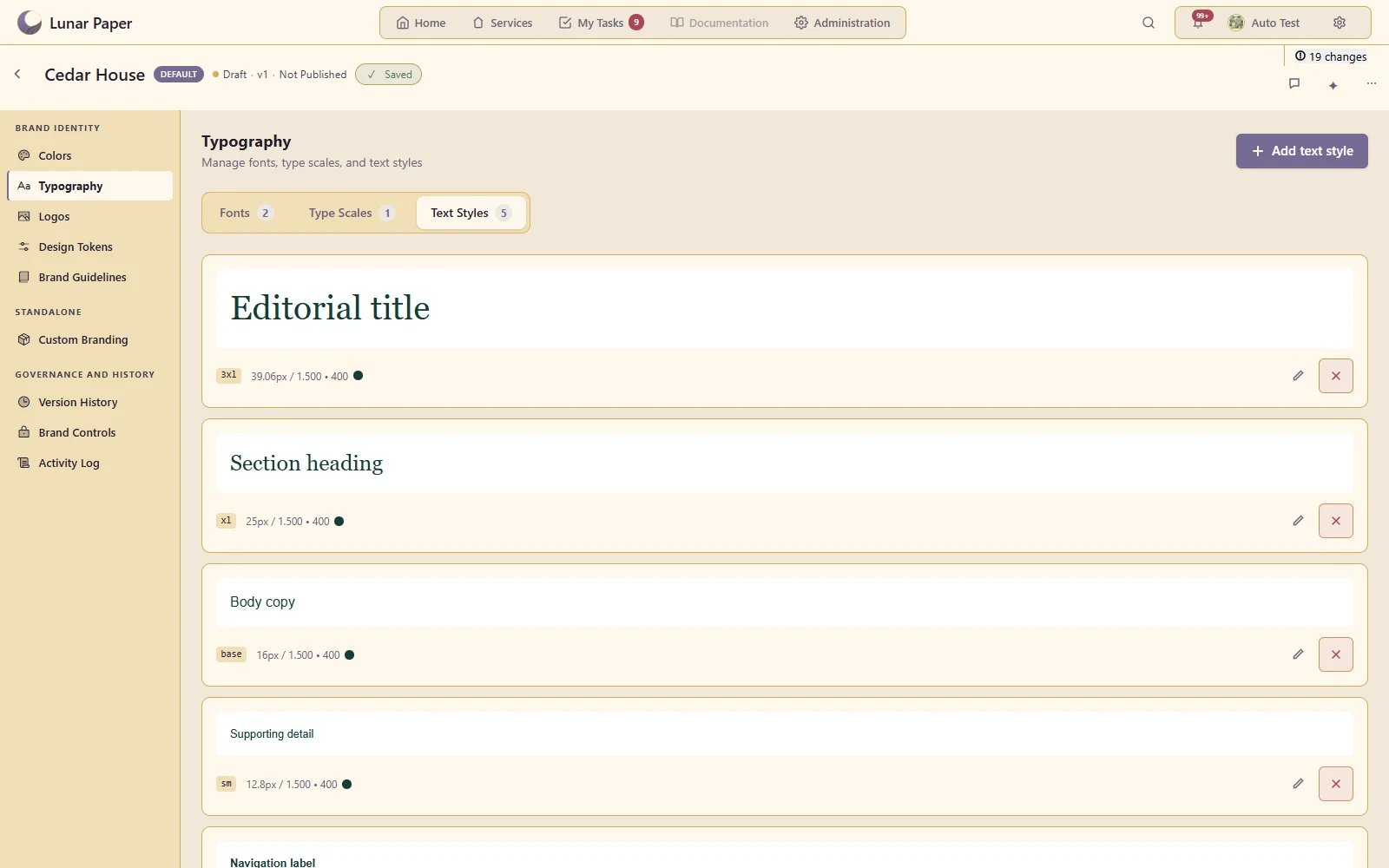
Type scales and text styles

Connect fonts to a repeatable hierarchy of headings and body text.

Use named heading, body and supporting styles linked to the editorial scale
Highlights · 03

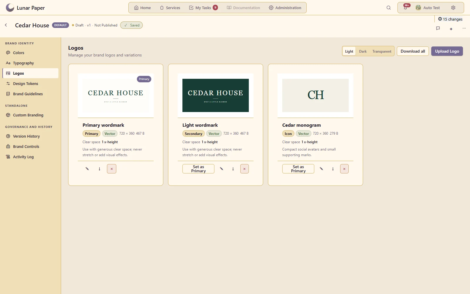
Logo variants

Store primary and alternative logos with their intended metadata.

Choose the primary, light and compact versions of the Cedar House identity
Highlights · 04

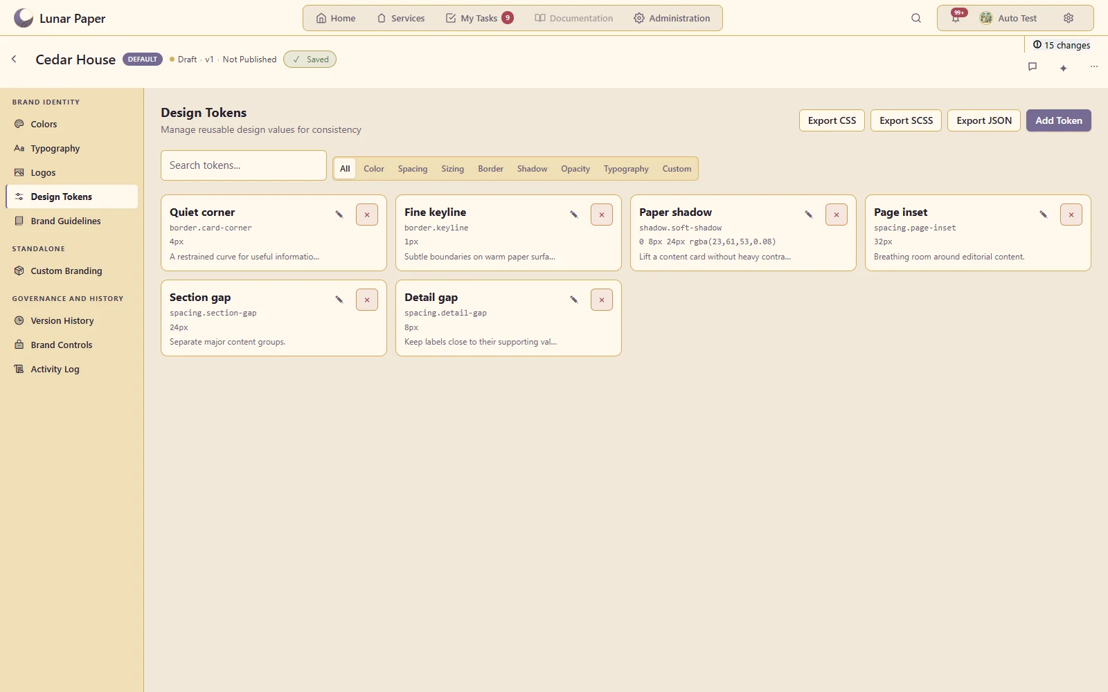
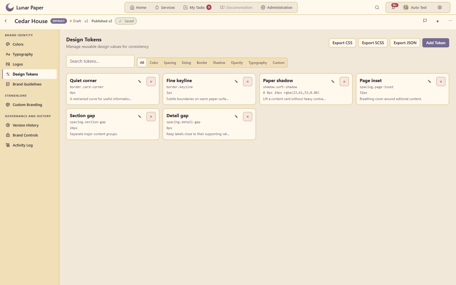
Design tokens

Name reusable design values and their supported property scopes.

Keep spacing, corners and shadow values in a reusable design system
Highlights · 05

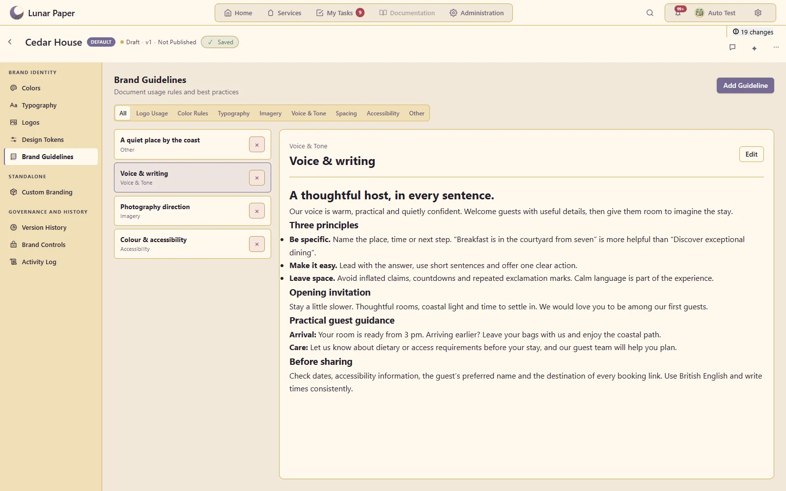
Rich brand guidelines

Explain voice, imagery and usage rules with structured written examples.

Give collaborators practical voice principles, welcome copy and a publication checklist

A closer look

06 — 20
A closer look · 06

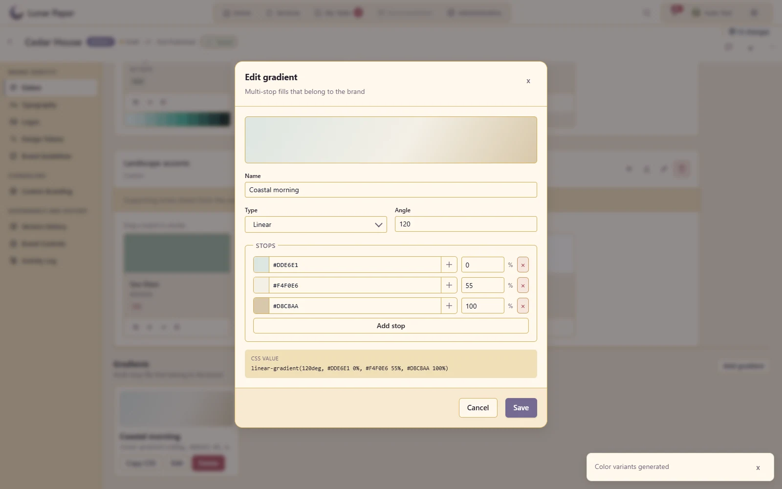
Gradients

Define a branded gradient as part of the visual language.

Build a three-stop gradient from the landscape palette
A closer look · 07

Colour variants

Generate and manage related shades or variations from a base colour.

Develop related Evergreen shades from the original brand colour
A closer look · 08

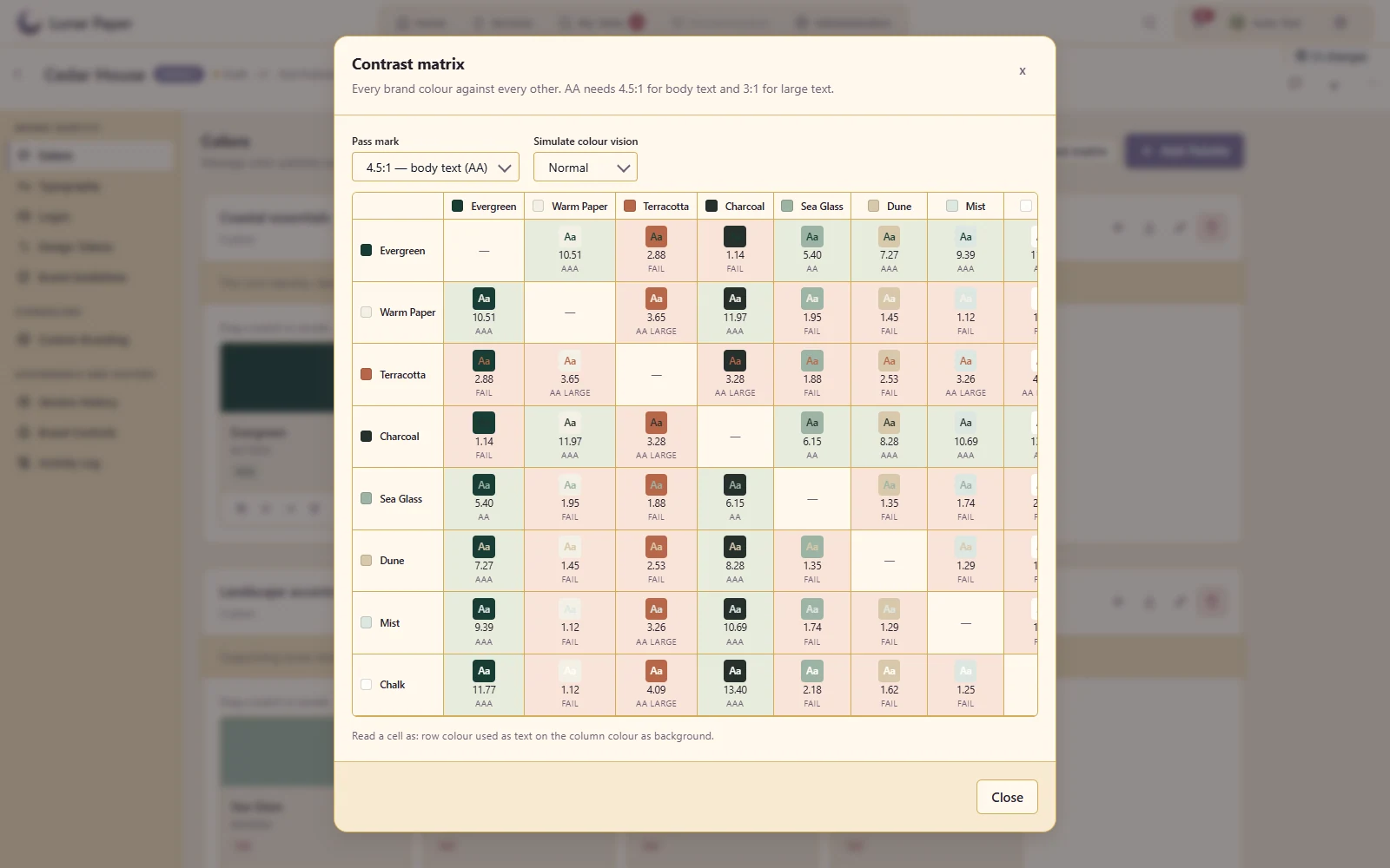
Contrast matrix

Compare foreground/background combinations across a palette.

Compare every palette pairing before choosing text and background colours
A closer look · 09

Colour-vision simulation

Inspect how palette choices appear under the available simulation modes.

Inspect the coastal palette with a colour-vision simulation
A closer look · 10

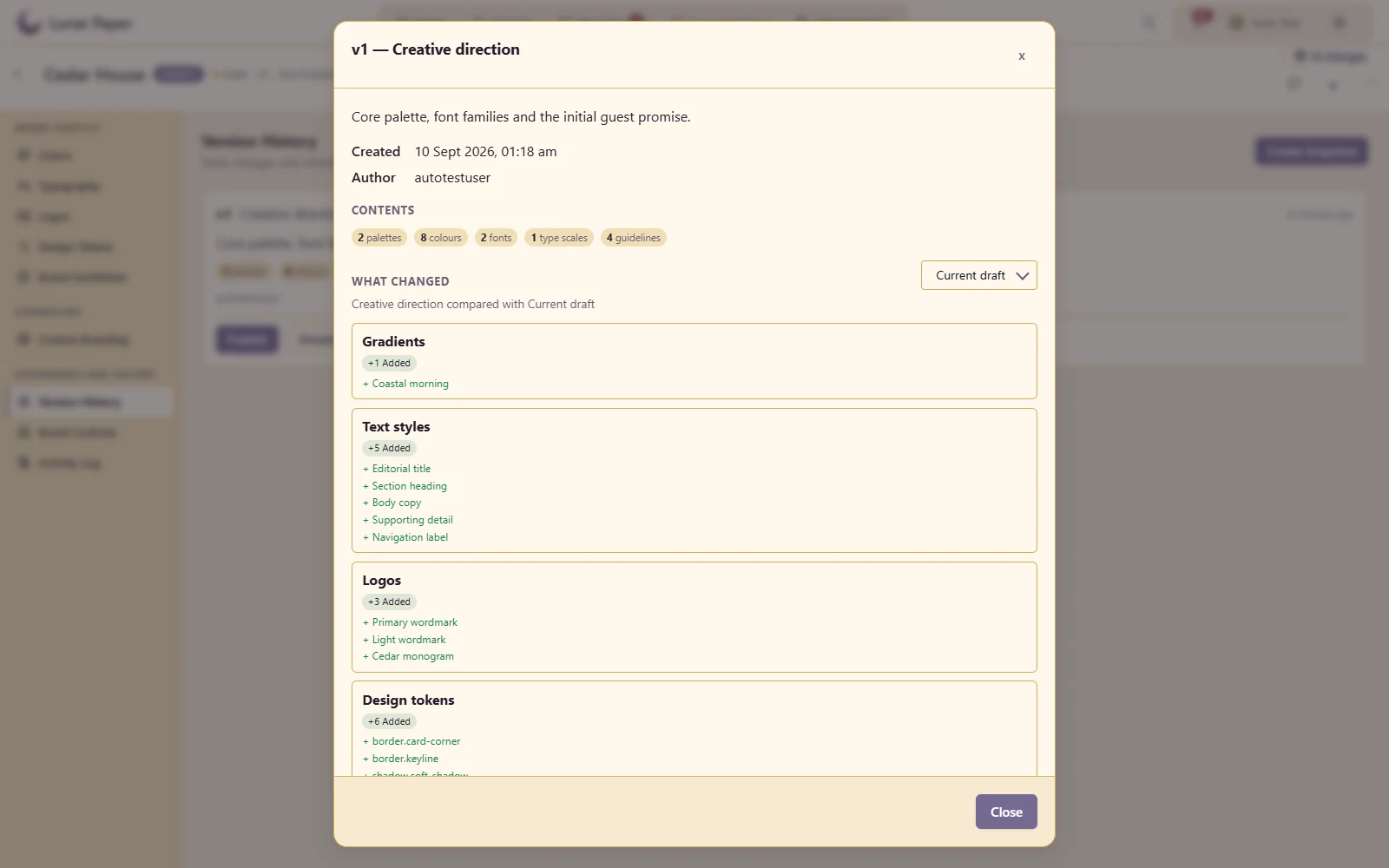
Brand versions and differences

Preserve a brand milestone and inspect what changed between versions.

Review the exact additions and changes since the initial creative direction
A closer look · 11

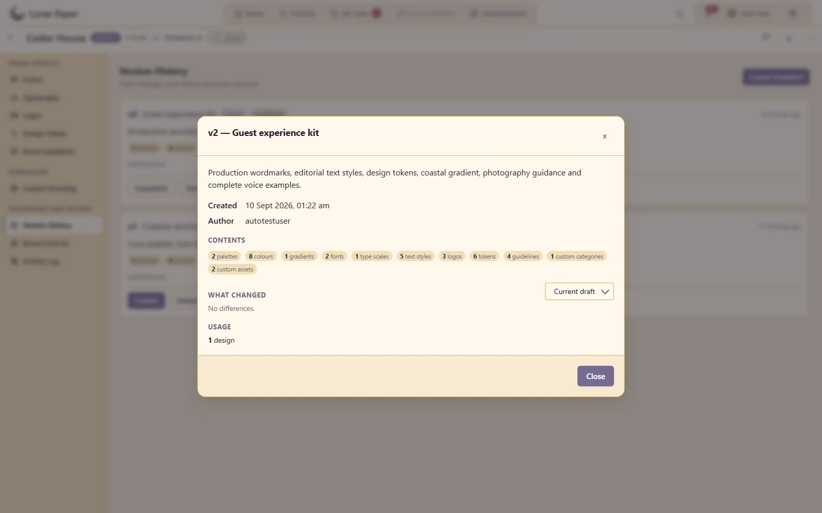
Version usage

See the available information about where a brand version is consumed.

Trace the published guest experience kit into the opening design collection
A closer look · 12

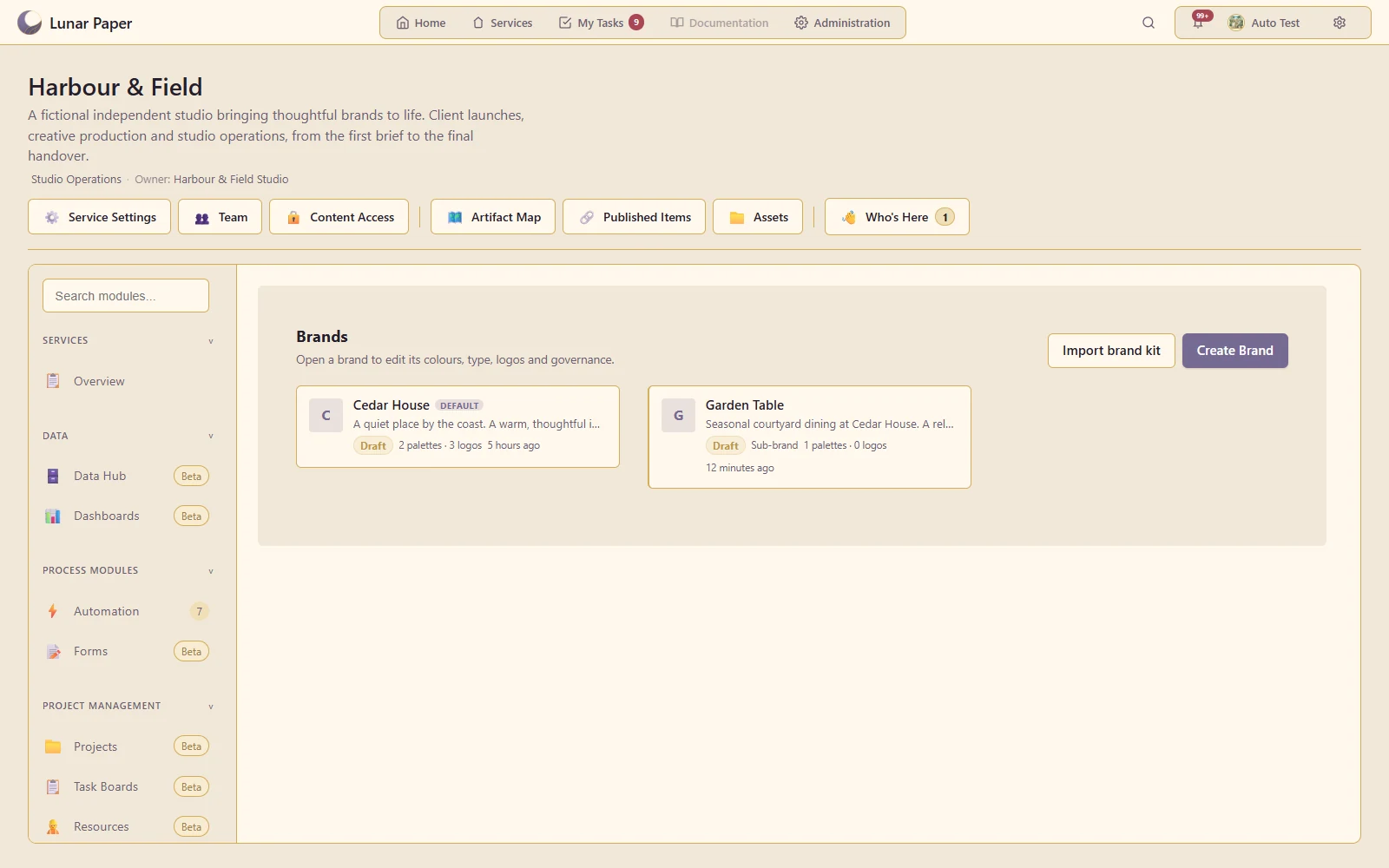
Multiple brands and a default

Manage several identities in a service and choose the usual starting brand.

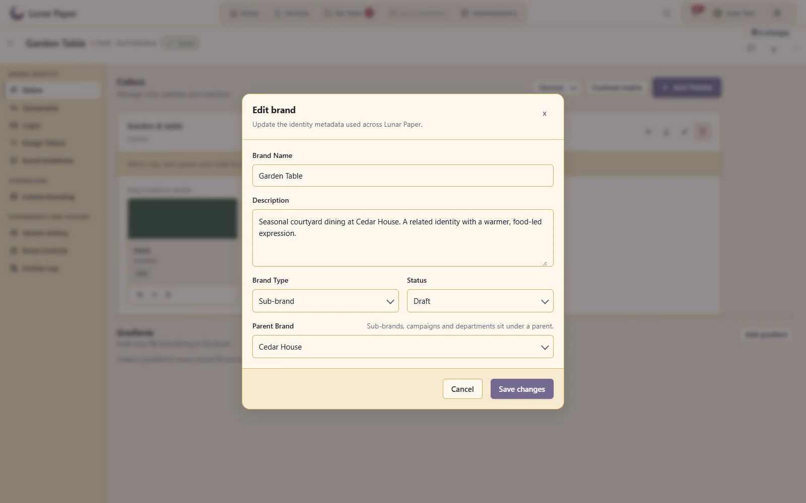
Manage the Cedar House master brand and its Garden Table dining identity
A closer look · 13

Parent and child brands

Record a hierarchy between related brand identities.

Keep the Garden Table dining identity under its Cedar House parent brand
A closer look · 14

Custom brand asset categories

Organise additional brand material beyond logos and colours.

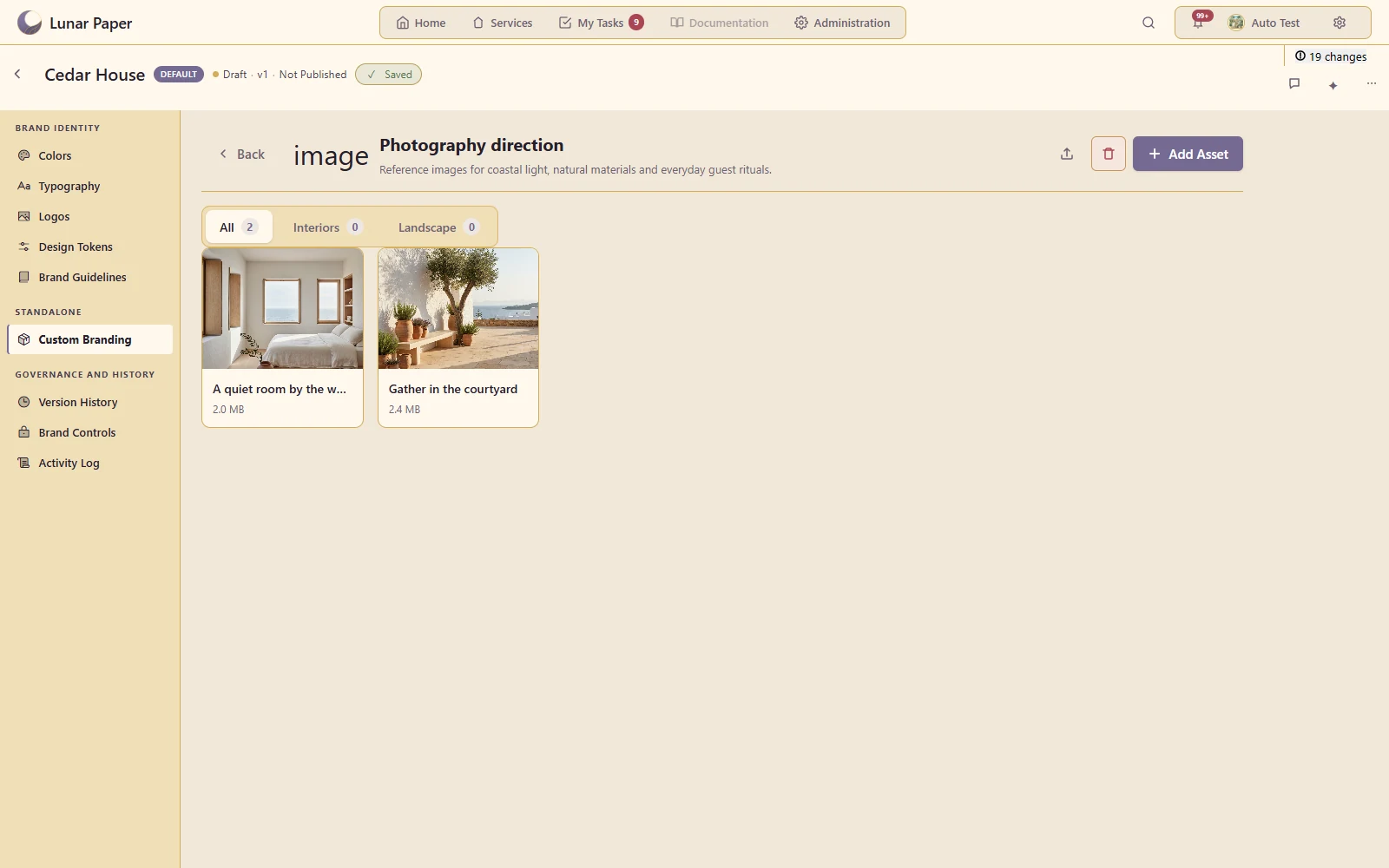
Keep reference photography and usage guidance in a dedicated brand category
A closer look · 15

Starter kits

Use an available brand starting point and adapt it to the organisation.

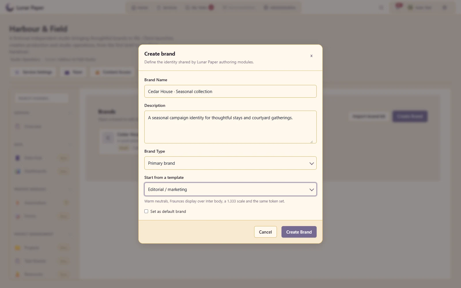
Start a seasonal identity with an editorial palette and typography kit
A closer look · 16

Palette and brand-kit import

Bring existing brand material into the structured kit.

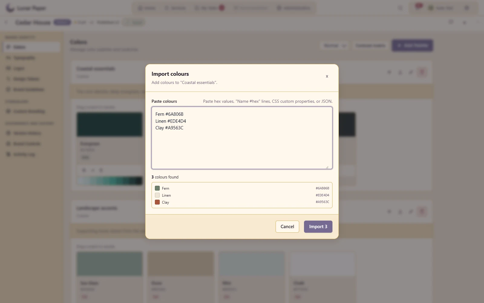
Preview a named palette import from existing colour values
A closer look · 17

CSS, SCSS and JSON token export

Hand reusable design values to implementation teams.

Export named design values as CSS, SCSS or JSON for implementation
A closer look · 18

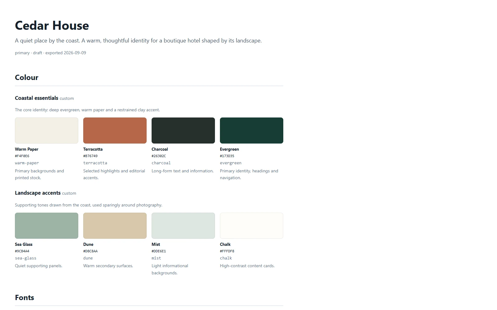
Brand-book export

Produce an HTML/CSS brand reference from the managed kit.

Share a readable brand book containing the managed colours, typography and guidelines
A closer look · 19

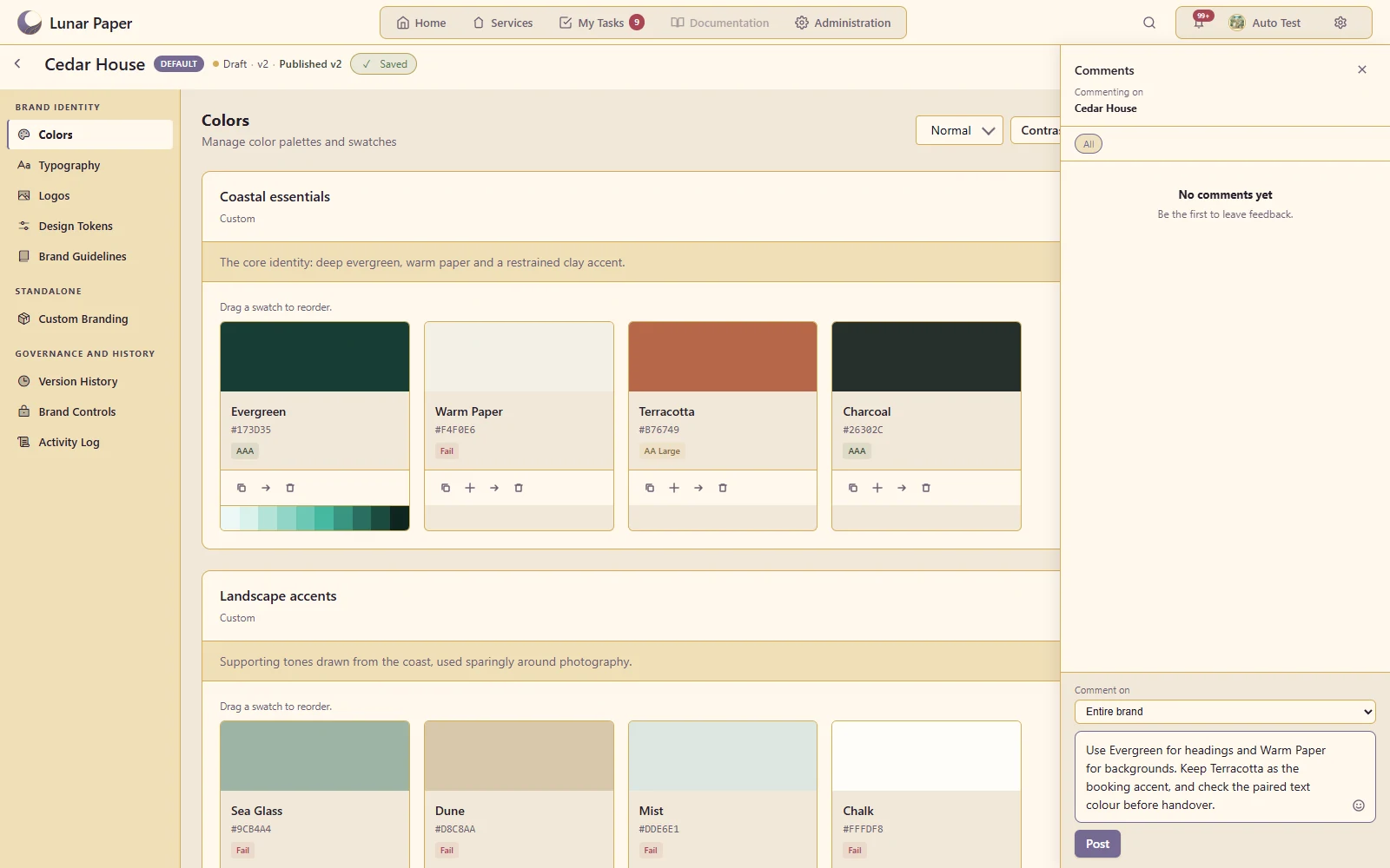
Entity comments and collaboration

Discuss a particular palette, logo or guideline with other contributors.

Prepare contextual feedback alongside the Cedar House colour kit
A closer look · 20

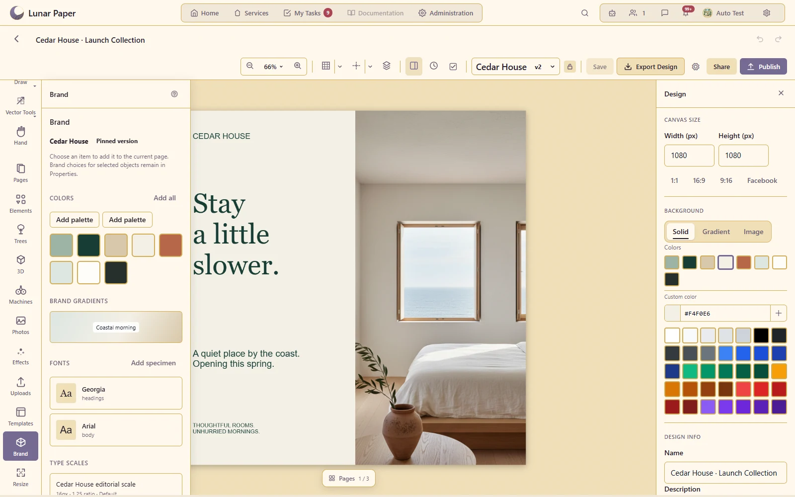
Reuse in creative applications

Show the same brand choices being used in a design, slideshow or email.

Use the published Cedar House colours, typography and logos inside the design collection

Additional Details

The main areas Brand Hub brings together.

Brand systems

Create and maintain shared brand records that organise the visual foundations used across the platform.

Colour and accessibility

Manage palettes, swatches and gradients with guidance for consistent and accessible colour use.

Typography and logos

Define fonts, type scales, text styles, logos and the rules that govern their application.

Tokens and guidelines

Turn brand decisions into reusable design tokens, specifications and clear usage guidance.

Controls and templates

Protect important brand choices through reusable resources and controls applied to connected creative work.

Collaboration and distribution

Review changes, manage versions and make approved brand resources available across the platform.

Get started

Try it on your own machine

Run the platform with all features for free for three people.